Ablexis
Science Simplified
CHALLENGE
Ablexis is a biotechnology company with decades of experience in antibody drug discovery. As the creators of a best-in-class transgenic antibody platform, the company plays a critical role in advancing therapeutic development.
Despite their expertise and reputation, their existing brand presence lacked the visual clarity and impact to match their leadership status. Ablexis approached us to develop a refreshed brand identity that would communicate their scientific credibility while feeling more modern, dynamic, and forward-thinking.
WHAT WE DID
Logo
Visual Identity
Collateral
Photography
Illustration
Website Design
Production
Brand Assets
OUR APPROACH
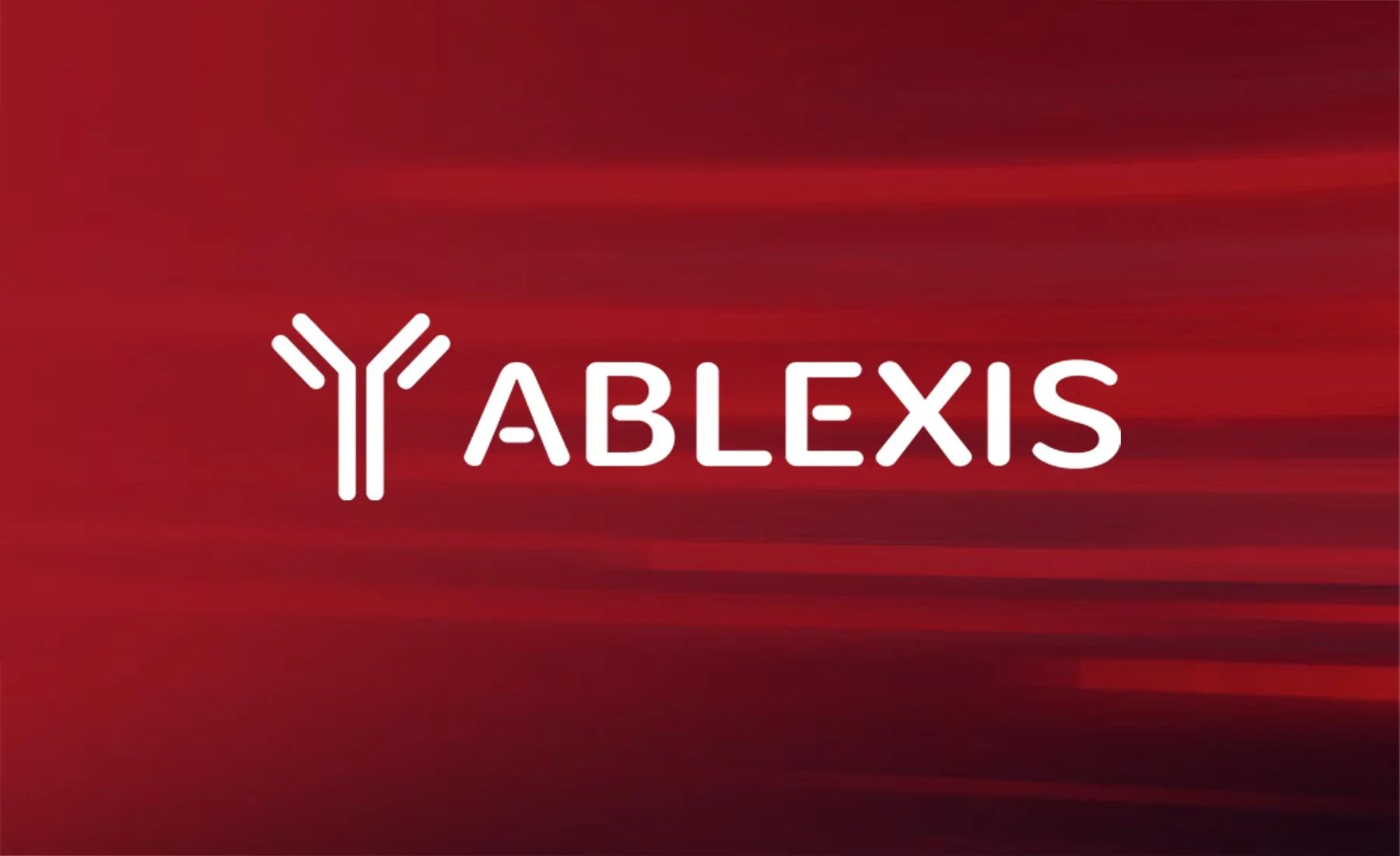
Our strategy integrated the antibody symbol at the heart of the visual identity. This icon, core to the company’s mission and story, became the primary brand marker along with refined typography that feels both precise and approachable.
We preserved elements of the original identity, such as the color, to maintain brand equity while introducing secondary graphics like angular stripes to signal innovation and momentum.
The updated branding system extended seamlessly into digital, where we also led the redesign of the Ablexis website. Our goal was to balance clarity with credibility and create a site that made complex science feel accessible, while reinforcing the company’s expertise and leadership.
RESULTS
The refreshed Ablexis identity elevates the brand across all touchpoints—from logo and visual language to digital experience. With a strong symbol, refined color palette, and clean graphic system, Ablexis now embodies the stature and confidence of an industry innovator, positioning the brand for continued growth and recognition in biotechnology.


