

Jose Cuervo
Every Detail Distilled
CHALLENGE
Jose Cuervo has been producing tequila for over 250 years at La Rojeña, Latin America’s oldest active distillery. From global blockbusters to artisanal small-batch offerings, the brand blends history, craftsmanship, and innovation across its extensive portfolio.
We were brought in to help evolve several of Cuervo’s most important lines—each with distinct needs, audiences, and stories. Whether refining the revered Reserva de la Familia, premiumizing the Don Julio experience, or refreshing ready-to-drink (RTD) Authentic Cuervo Margaritas, the mission remained the same: elevate brand expression while preserving the heritage that defines Jose Cuervo.
WHAT WE DID

To solve this, we designed a custom branded boot that introduces the Cuervo equities without detracting from the uniqueness of the box design. This approach allows consumers to instantly recognize Cuervo while preserving what makes Reserva de la familia unique.
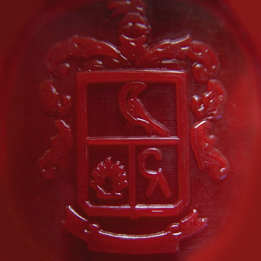

We created a simplified Reserva De La Familia logo, so that it is easily extractable for use across touchpoints. This provided Cuervo with a consistent, premium visual identity that could be applied well beyond the bottle.


Jose Cuervo Tradicional
For Tradicional, a specialty, limited-edition tequila sold only at Cuervo’s tequilería, we created a minimalist, heritage-inspired identity. Clean typography, simple layouts, and refined visual cues, including a subtle reference to the Cuervo crow, brought purity and authenticity to the forefront.

Authentic Cuervo Margaritas (ACM)
Our redesign of the Ready-to-Drink Margaritas balanced brand equity with clarity. The previous design’s busy, illustrative background obscured key messaging, so we refined the layout to enhance legibility, hierarchy, and modern appeal—while preserving the brand’s signature color cues. The result: a simplified, premium look that consumers instantly recognize as Authentic Cuervo Margaritas.
Don Julio 1942
For Don Julio, we created high-end outer packaging that supported the brand’s premium positioning. A new outer box structure elevated shelf presence, while design elements like an agave leaf pattern added texture, authenticity, and a link back to the core ingredient.

Logo
Visual Identity
Packaging Design
Design Strategy
Collateral
Photography
Illustration
Messeging
Production
Brand Assets
Brand Identity Guidelines
RESULTS
A Portfolio Refined
Across every engagement, our work elevated the Jose Cuervo portfolio—clarifying each brand’s positioning while amplifying the emotional and sensory cues that drive consumer connection.
Reserva de la Familia now delivers a complete, collectible experience.
Don Julio packaging embodies the ultra-premium expectations of a top-shelf spirit.
Authentic Margaritas achieved greater shelf impact and clarity without losing its heritage.
Tradicional conveys artisanal purity with elegance and restraint.
We also developed comprehensive brand books and standards to ensure long-term cohesion and consistency. From packaging to POS, and across formats, price tiers, and audiences, every expression now tells the Cuervo story with clarity, confidence, and craft.
APPROACH
Reserva de la Familia
Cuervo’s crown jewel, Reserva de la Familia, is released each year in a limited-edition, hand-painted box. Although the box was intended to be a central part of the brand’s story, it lacked clear visual cues or branding to connect it to Cuervo. This absence of identity led to consumer confusion and caused retailers to separate the box from the bottle—diminishing the impact of what was meant to feel rare, special, and unmistakably Cuervo.