
The Shore and Country Club
A Waterfront Tradition, Refined
CHALLENGE
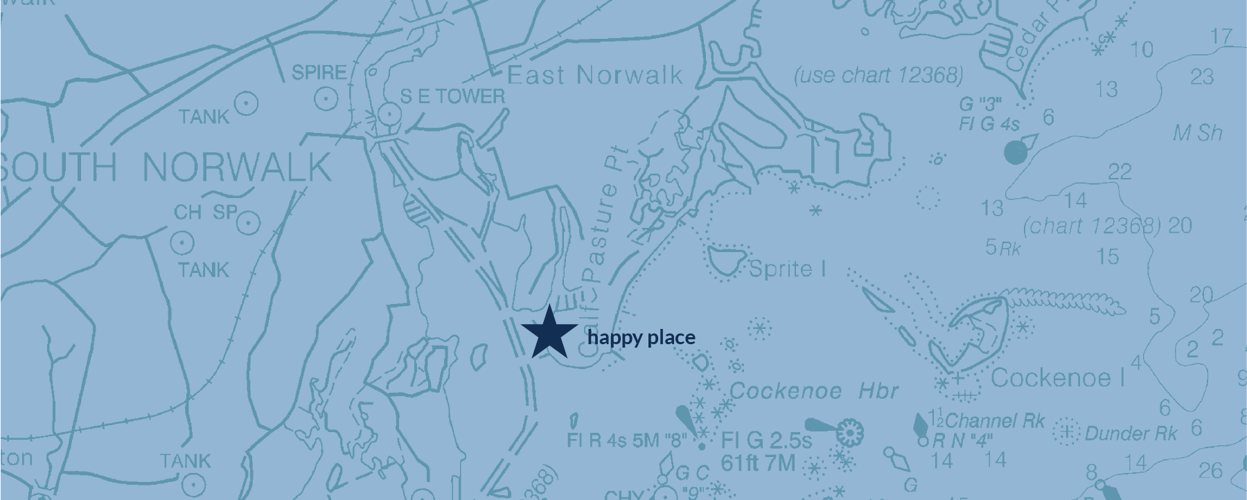
Set along the Long Island Sound in Norwalk, Connecticut, The Shore and Country Club offers a naturally beautiful waterfront setting with sweeping views, refreshing sea breezes, and a relaxed, resort-like atmosphere. Boating, swimming, tennis, dining, and social activities bring generations of families together, creating a close-knit community grounded in shared traditions and a deep sense of belonging.
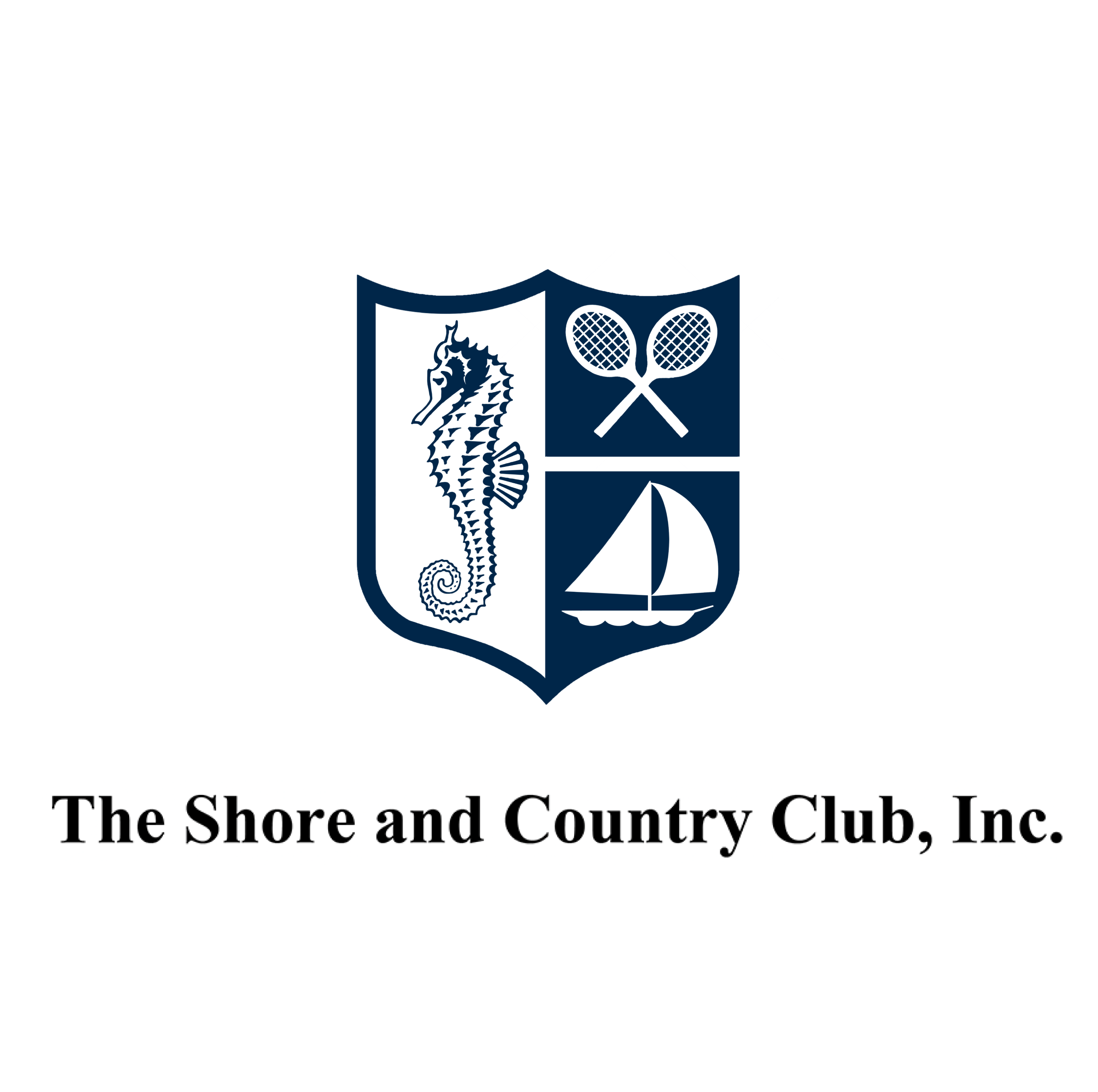
Across club communications, inconsistent typography, colors, and naming conventions weakened the identity’s cohesion. The existing logo was also crowded and difficult to reproduce cleanly across applications, particularly at small sizes or when embroidered on apparel.
The club needed a refreshed visual identity that could support its longstanding traditions and retain the recognition and meaning valued by legacy members, while presenting a more contemporary expression capable of attracting and retaining a new generation of members.
The objective was to preserve the identity's core brand equity while creating a more refined and contemporary expression of The Shore and Country Club. Just as importantly, the process needed to build alignment among members and help them feel connected to the club's next chapter.
WHAT WE DID
Logo
Visual Identity
Collateral
Production
Messaging
Brand Assets
Brand Identity Guidelines
OUR APPROACH
We began by auditing the club's identity across existing materials and historical applications. Working closely with the management team, we identified the elements members valued most and established a shared vision for an evolution that would feel both familiar and renewed.
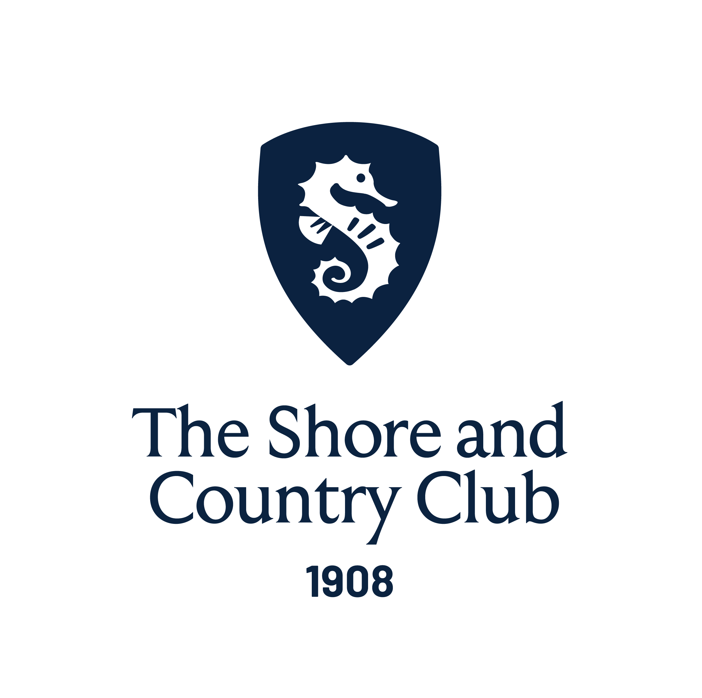
AFTER
We evolved the seahorse and shield emblem into a sleeker, more contemporary mark. By subtly shaping the seahorse into an “S,” we created a stronger connection to the Shore and Country Club name.
BEFORE
The existing logo needed an update, something that would feel contemporary, premium, and flexible enough to be applied consistently across all touchpoints.
We identified the club’s established blue color palette, shield and seahorse as its core visual equity; the logo needed to evolve while preserving these visual elements.
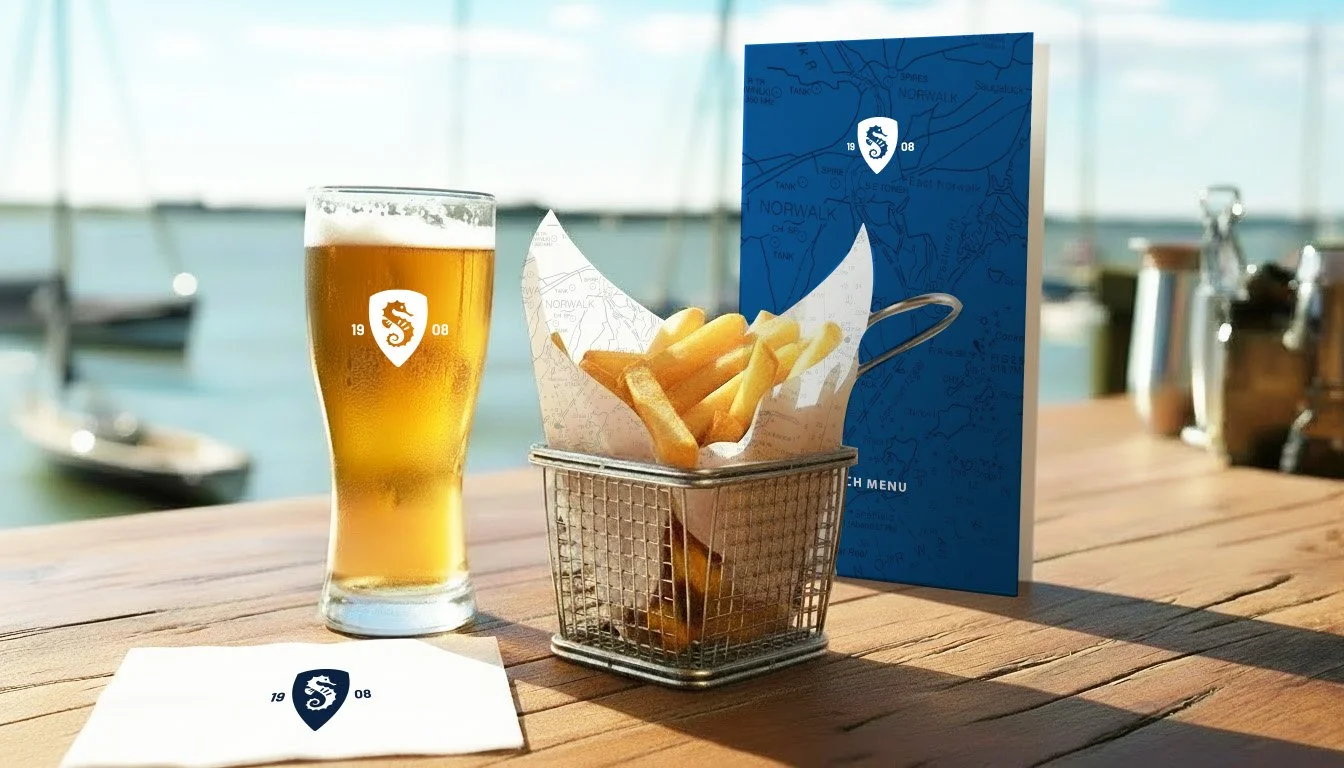
Simplified identity improved clarity and reproduction across print, digital, signage, and apparel.

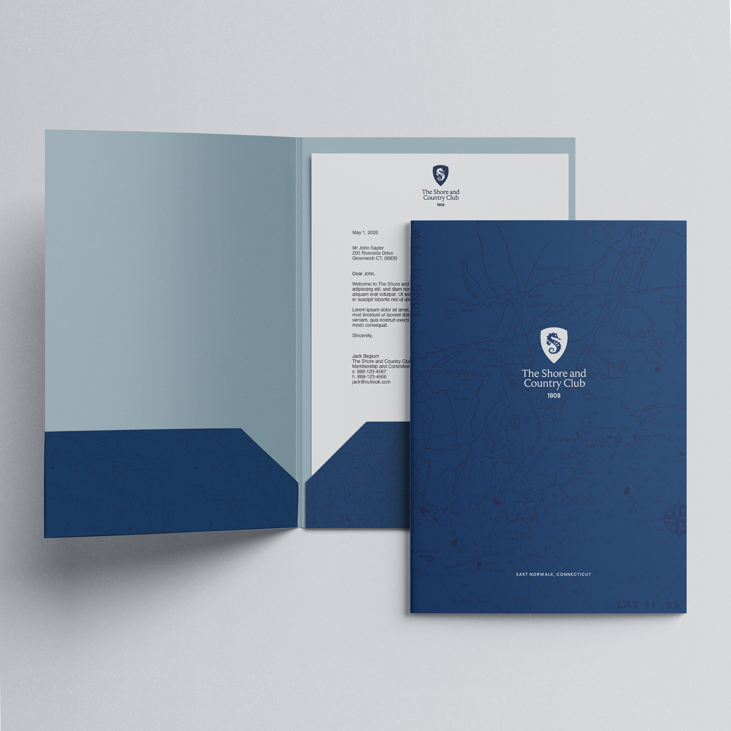

The redesigned admissions materials were chosen as the first major applications because they are often a prospective member’s first meaningful interaction with the brand. Their elevated design reinforces the quality and value of membership at a critical moment of choice.
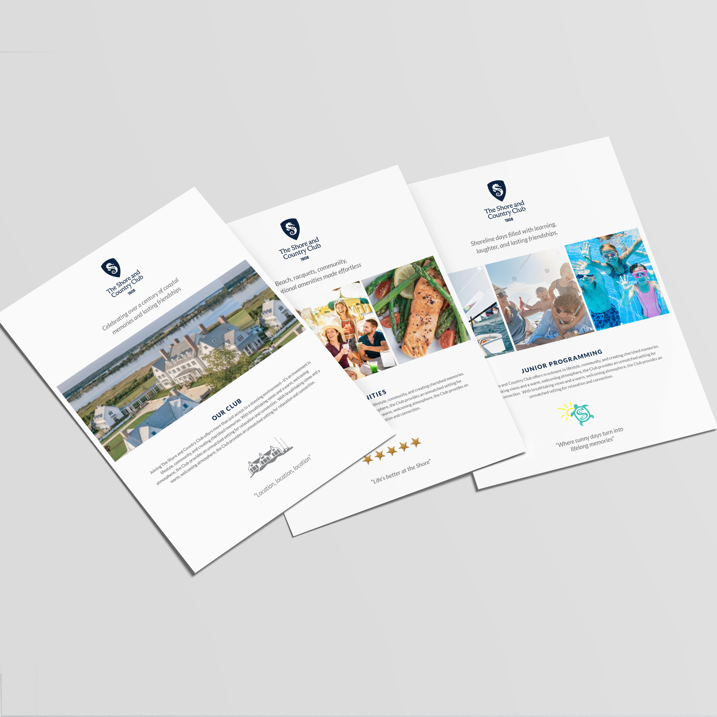

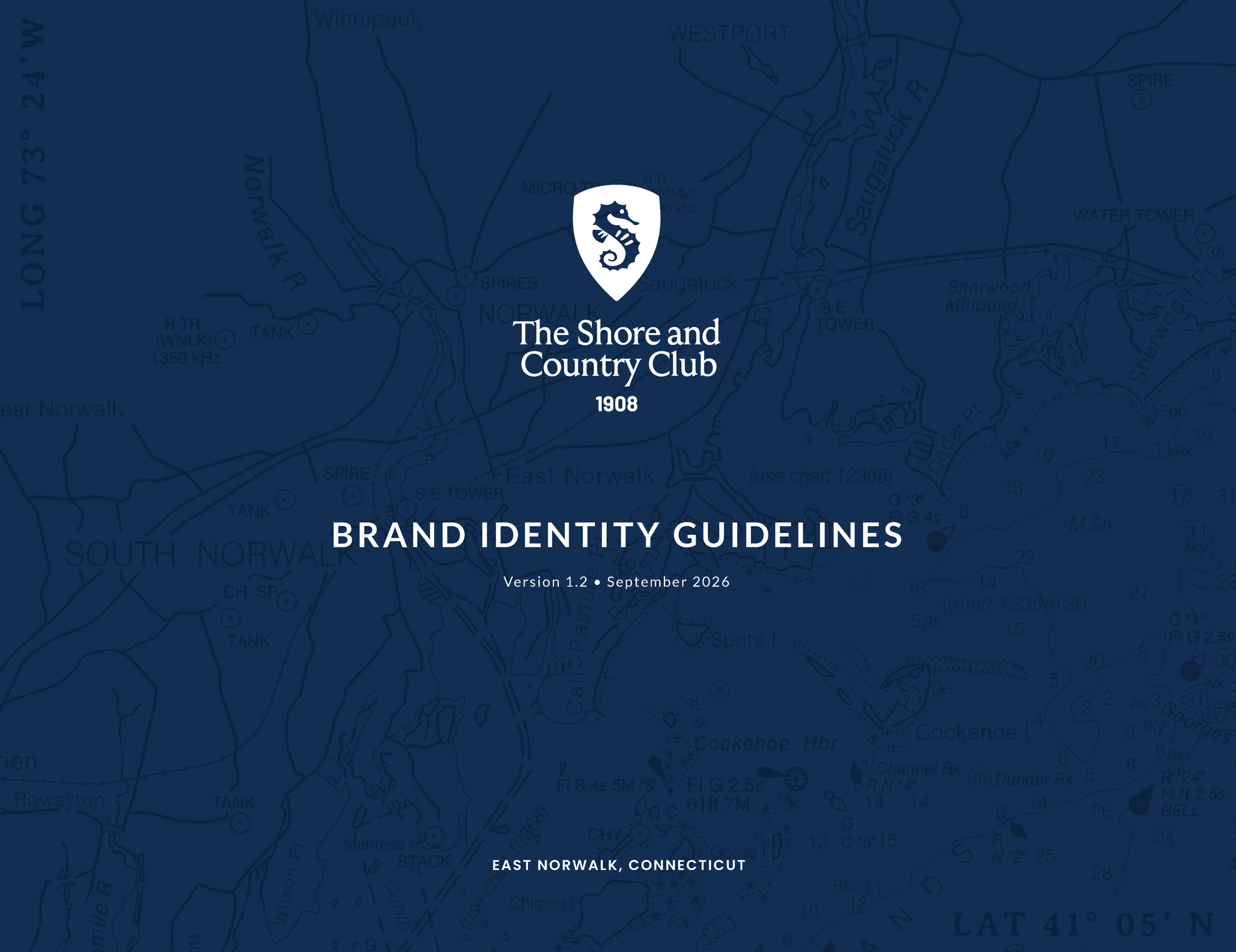

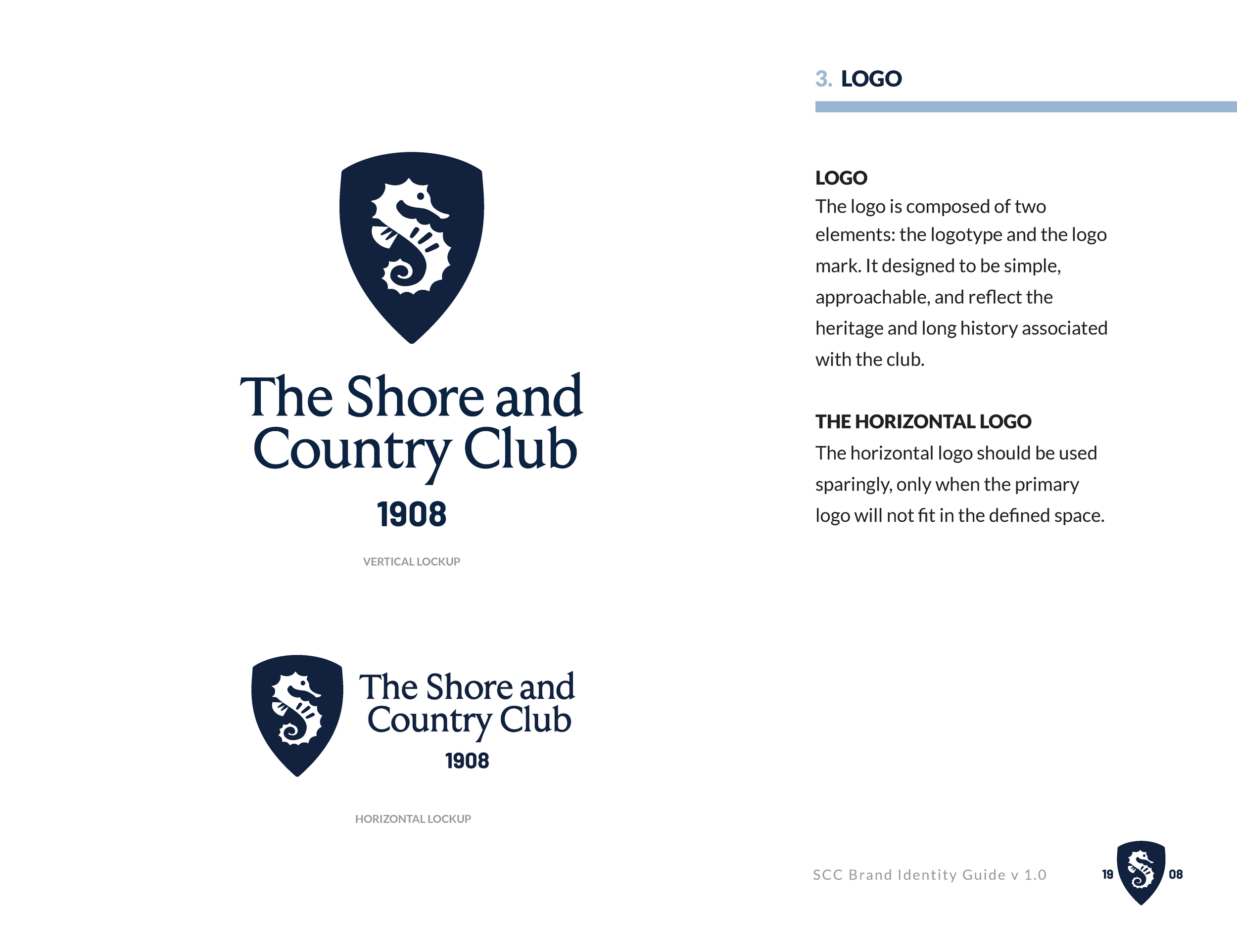


Brand Guidelines created to support clarity and consistency
RESULTS
The evolved identity preserves what made The Shore and Country Club special while creating a more cohesive, polished, and flexible foundation for the future.
Key Outcomes:
A simplified, more contemporary seahorse and shield emblem that preserves key visual equity and reproduces clearly across sizes and applications
Consistent naming conventions, typography, and use of the club’s established blue color palette
Improved usability across print, digital, apparel, and signage
Refined collateral and admissions material that create a stronger first impression and reinforce the value of membership
Greater alignment and support among the Branding Committee and membership
Clear brand standards that help internal teams and outside partners apply the identity consistently